Beautiful Thing
Brad was brought in by Flightplan Ventures to lead brand strategy for Beautiful Thing, a startup skincare brand built on the ancient power of tallow. Known for its confident tone and minimal, ingredient-first formulas, Beautiful Thing has quickly carved out a place in the modern wellness space with products that feel both grounded and elevated.
Brad Neathery, brought in as the lead brand strategist for Beautiful Thing, played a pivotal role in articulating the brand’s purpose, positioning, and voice. Drawing from his deep background in lifestyle branding, he crafted a strategy that honored the ancestral roots of tallow while appealing to a modern consumer.
Recognizing a cultural fatigue with sterile, over-clinical skincare brands and a growing movement toward whole, traditional living, Brad strategically aligned Beautiful Thing with this shift—tapping into a desire for rootedness, honesty, and ritual. This alignment helped the brand rise above the noise, communicating strength through softness and confidence without performance. Through this work, Beautiful Thing was positioned not just as a skincare line but as a cultural artifact—one that speaks fluently to both the wellness-informed mother and the design-forward minimalist. The result is a brand that doesn’t chase hype, it reclaims heritage.
Brand Strategy
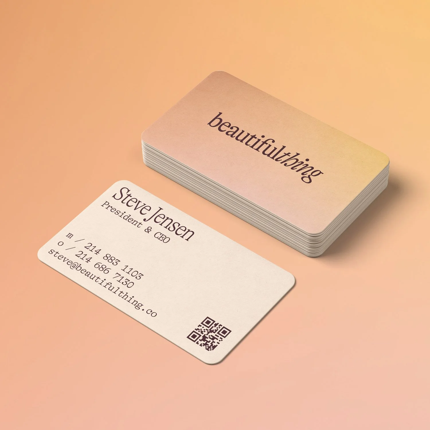
Brand Identity & Communication
Packaging Design
Web UI/UX
Environmental Experiences
AREAS OF FOCUS
My goal was to unearth a brand that felt both timeless and bold—where ancient ingredients could meet modern beauty with unapologetic clarity.
-BRAD NEATHERY

Brand Strategy
Brad’s brand strategy for Beautiful Thing was rooted in cultural relevance, emotional resonance, and ingredient integrity—centered around the unapologetic use of tallow as the brand’s hero element. This creative direction challenged conventional beauty norms, positioning tallow not as a compromise but as a signal of clarity, intention, and ancestral wisdom. Brad architected the brand’s identity to feel both nostalgic and novel, allowing it to stand apart in a saturated market obsessed with trends and synthetics.
Brad’s strategic oversight shaped the way Beautiful Thing shows up—from its packaging to its storytelling—resulting in a brand that doesn’t just sell skincare, but communicates a lifestyle of intentionality and beauty rooted in tradition. His contribution left a lasting mark on Beautiful Thing’s trajectory and its resonance with customers.
Steering the Cultural Shift
Brad’s brand strategy for Beautiful Thing was rooted in cultural discernment and emotional clarity, anchored in the unapologetic use of tallow as the brand’s hero ingredient. Rather than hiding behind clinical jargon or trendy actives, Brad positioned tallow as a symbol of trust, tradition, and timeless effectiveness. His strategy shaped a brand that felt as intentional as the women it was made for—cutting through industry noise with confidence and restraint. From naming and tone to packaging and positioning, Brad crafted an identity that honored ritual, invited belonging, and sparked curiosity across both natural beauty and design-forward audiences.
Sensing a cultural shift toward ancestral wellness, slow living, and clean simplicity, Brad aligned Beautiful Thing with this movement—tapping into a consumer base disenchanted by greenwashed marketing and overwhelmed by overly complex routines. His strategy centered on storytelling that made space for stillness, strength, and femininity without performance. The result was a brand that didn’t compete in the skincare rat race—it redefined what it meant to belong in a bathroom cabinet. Through this approach, Beautiful Thing emerged as more than a product line—it became a quiet rebellion in a loud industry, positioning itself as a culturally significant voice in the next era of clean beauty.

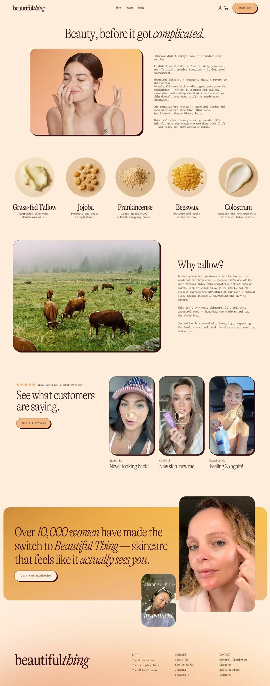
Digital Interaction
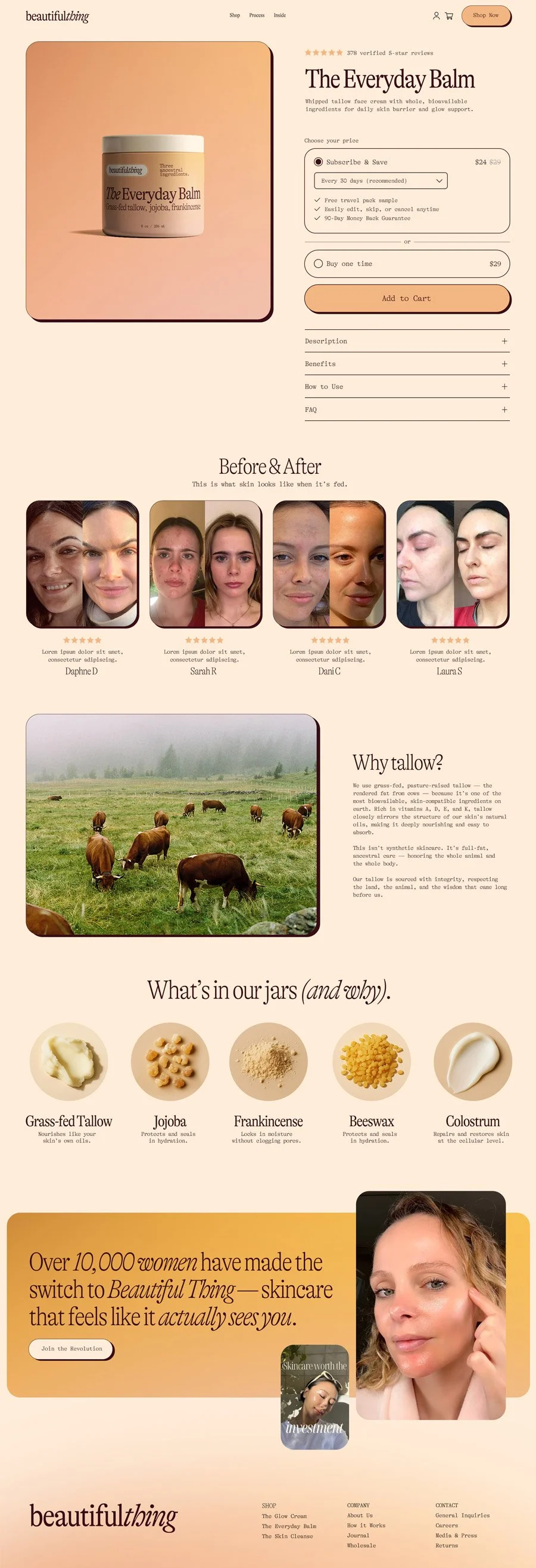
The UI/UX strategy for Beautiful Thing is rooted in the same values as the product itself: clarity, restraint, and trust in what’s real. The experience is intentionally quiet — no pop-ups, no noise, no visual chaos. Just the essentials, beautifully delivered.
Brad designed the interface to feel like a breath out. Clean typography, warm gradients, and negative space allow the skin to take center stage — in imagery and in messaging. Navigation is minimal but intuitive, guiding the customer with ease, not effort. Every page is built to mirror the product: soft, nourishing, and confidently simple.
Ingredient education and emotional resonance are equally prioritized. PDPs balance storytelling and clarity — with ingredient breakdowns that feel both human and informed. Subscriptions are framed not as sales tactics, but as rituals.
This isn’t skincare screaming to be bought. It’s an invitation to return to what works — and every scroll, click, and hover is designed to reflect that.

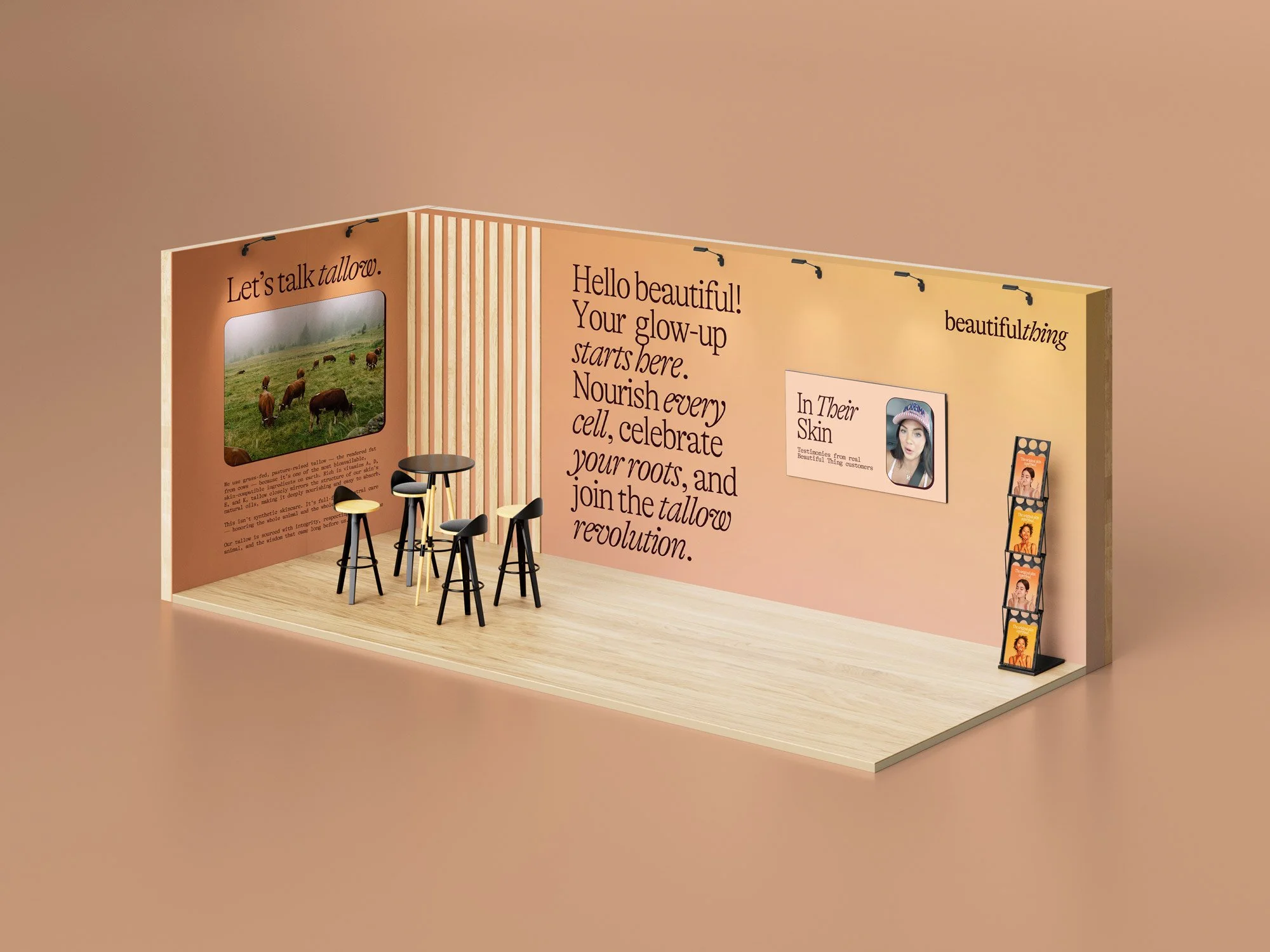
Beautiful Thing’s exhibit design is a bold reimagination of what skincare storytelling can look like in a physical space. Every surface is intentionally styled to reflect the brand’s quiet rebellion—from warm, skin-toned gradients that mirror the product’s organic richness to the layered type hierarchy that draws the eye like a well-paced editorial. Instead of relying on overproduced gloss, the booth leans into authenticity with real customer portraits, tactile wood textures, and approachable conversation zones. It’s skincare you can see, feel, and step into.
Exhibit Experience
The layout invites passersby into the world of tallow—not just as an ingredient, but as a philosophy. A large grazing scene and headline wall set the tone, while the central feature—“In Their Skin”—elevates real women as the campaign heroes, shown front and center. Every detail is rooted in Beautiful Thing’s core ethos: nourish every cell, honor what’s real, and celebrate the revolution. It’s more than a display; it’s a glow-up manifesto brought to life.
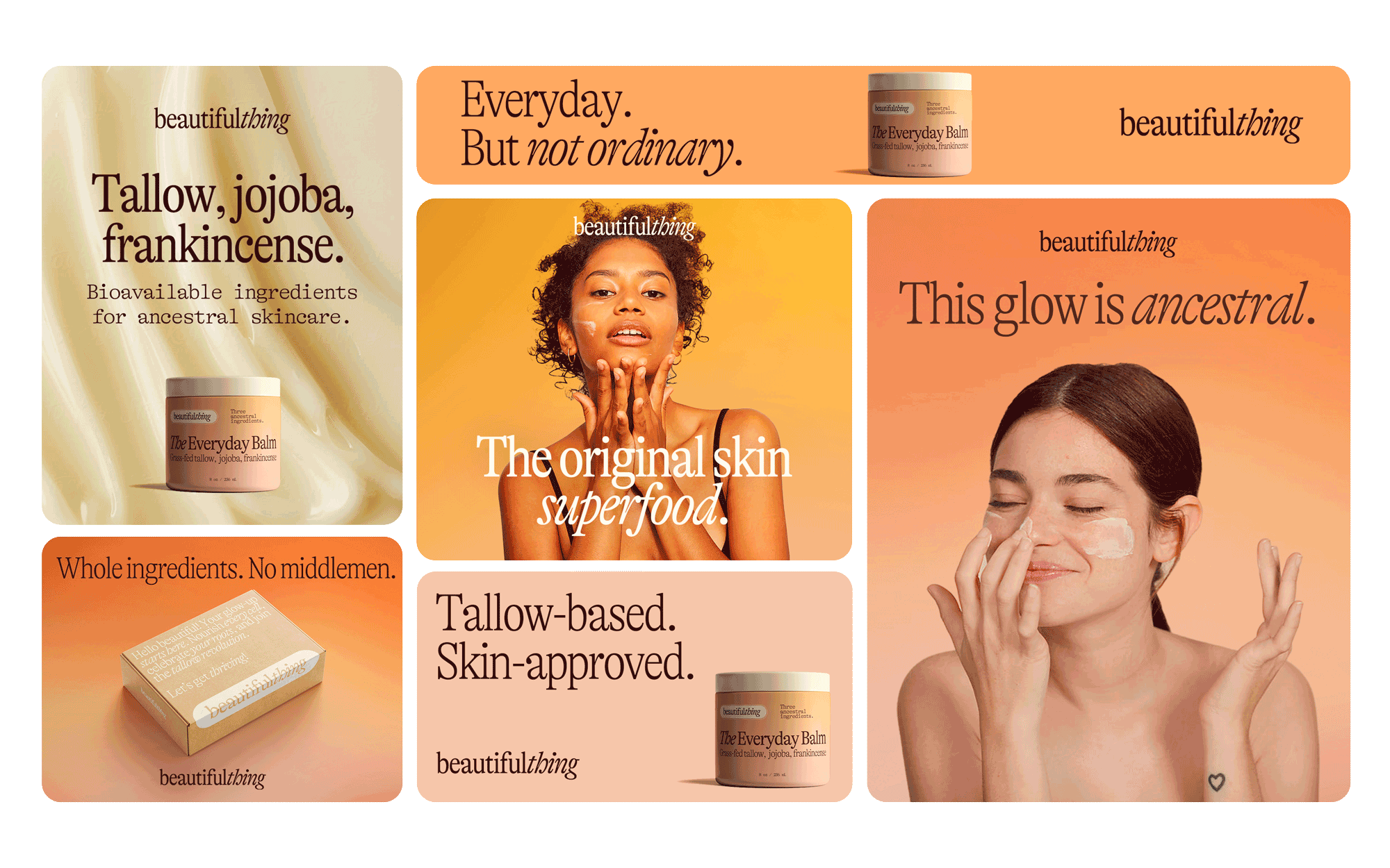
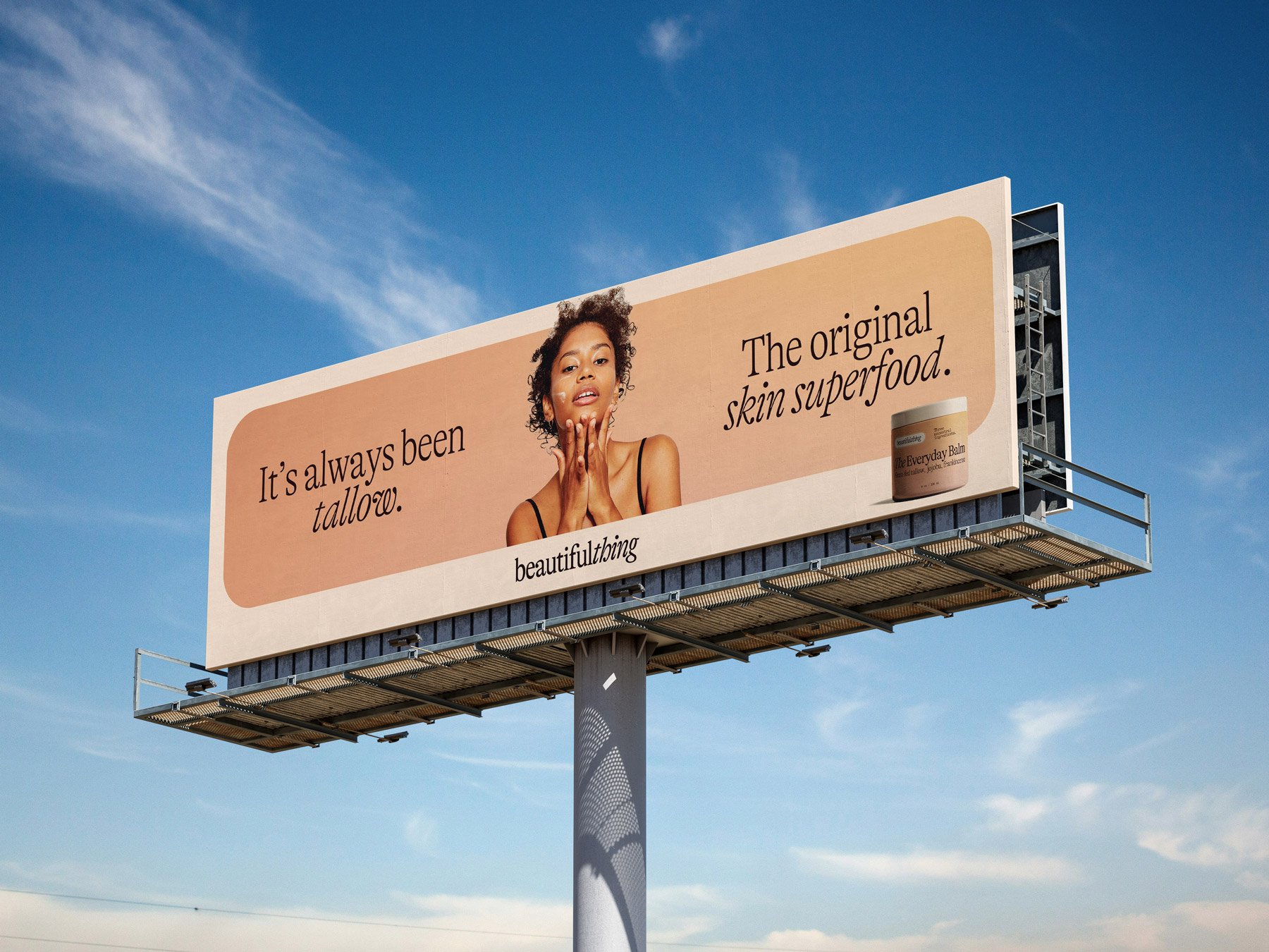
For Beautiful Thing, digital advertising is more than performance—it's storytelling that converts. Every ad is crafted to stop the scroll with visceral, emotionally charged visuals that invite touch and spark curiosity. We lean into macro shots, natural skin, and high-impact lighting that mirrors our brand photography, building instant recognition. Our copy is tight, tactile, and benefit-forward—positioning tallow not as a trend, but as a return to ritual. When users engage, they're not just clicking—they’re stepping into a brand that speaks to identity, nourishment, and belonging.
Digital Ads
We test multiple ad variants with real customer insights in mind—different skin types, concerns, and routines—to meet people where they are and move them toward checkout. Our strongest performing assets use native-feeling content paired with high-converting UGC and story-driven sequences. Every ad is part of a system: from static and video to retargeting and product education, we carry the same voice, values, and visual cues through the entire funnel. The result? Scroll-stopping creative with soul—and ROAS to match.